
Vehicle Wrap Design Tips Every Business Needs
What Makes a Business Vehicle Wrap Design Work?
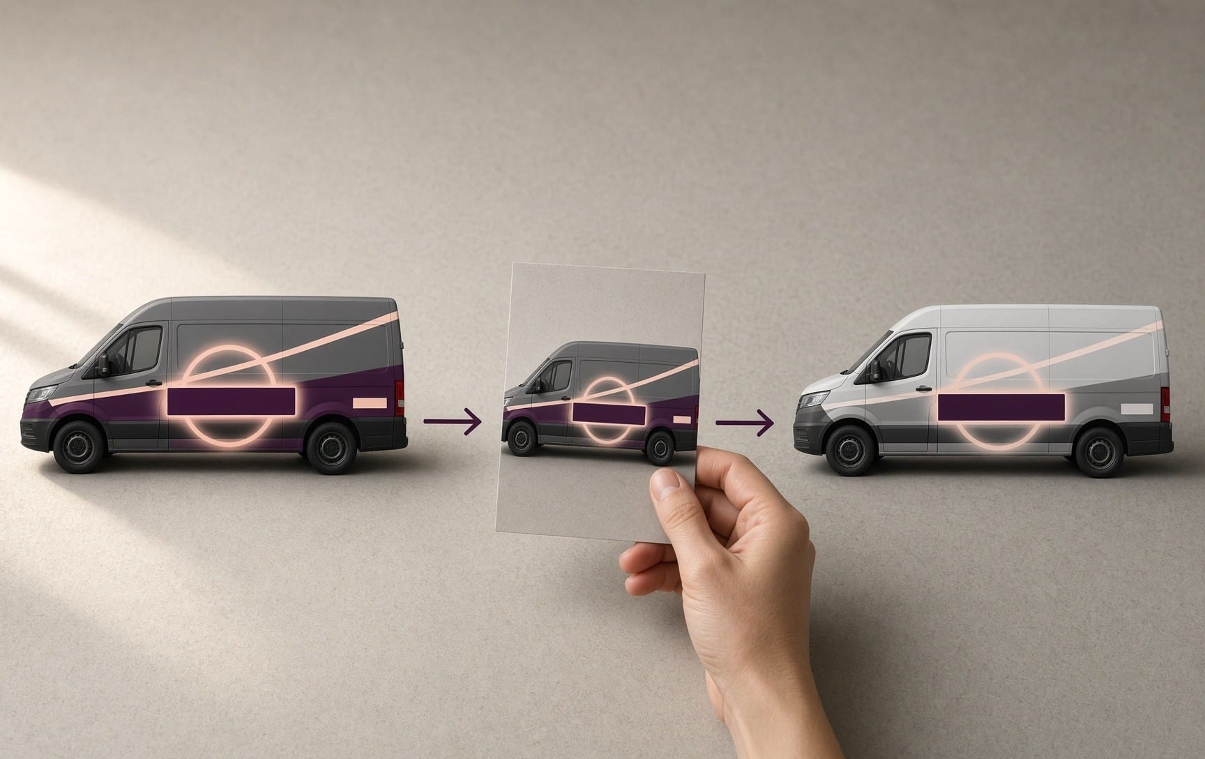
A business vehicle wrap design works when a stranger can read who you are, what you do, and how to reach you within a few seconds. That has to hold from a distance, in traffic, and on a real vehicle with doors, handles, and seams.
Four things get you there:
- A clear hierarchy: name and logo first, then what you do, then one way to reach you.
- Strong contrast at a size that reads from far away.
- A layout built for the vehicle's actual shape.
- The same system on every vehicle in a fleet.
These vehicle wrap design tips apply to corporate vehicle wraps of every size, from a single van to a mixed fleet. They also cover commercial vehicle wrap design for trucks, trailers, and cars.
Two quick tests catch most problems. Shrink the mockup on a screen, or step back about 30 feet, and look at it for a moment. Then convert it to grayscale. The company name should still read in both.
What Should a Business Vehicle Wrap Include?
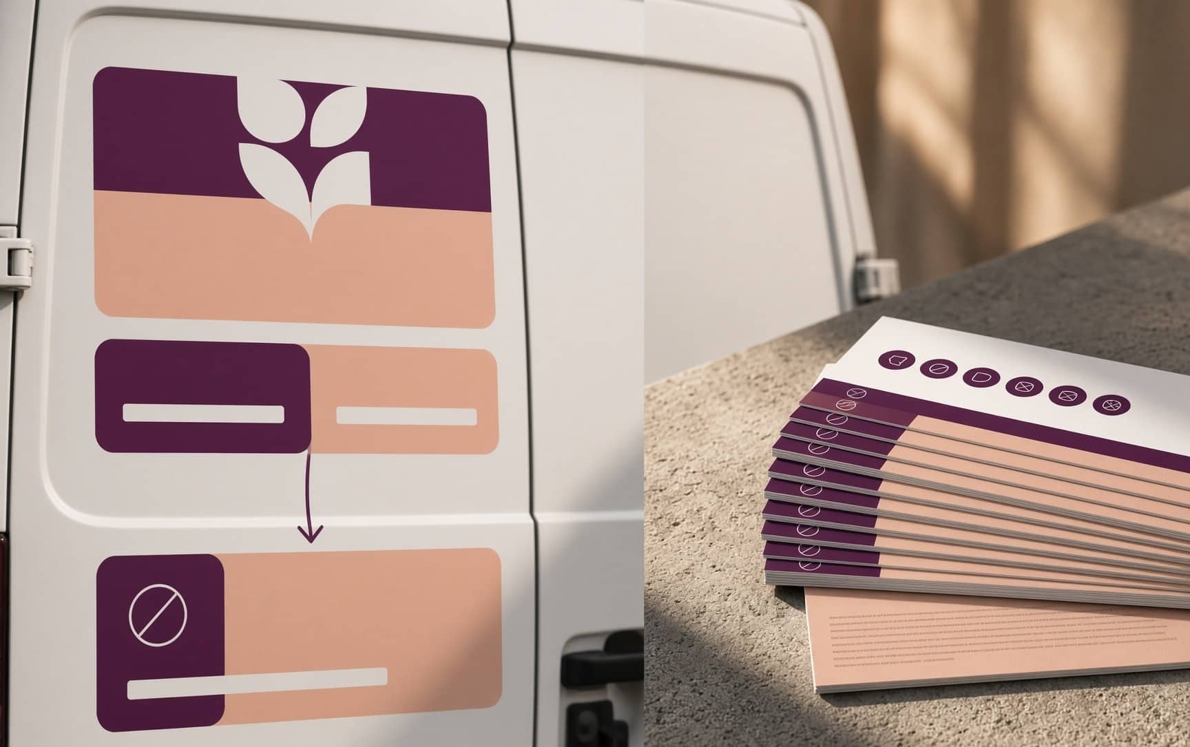
A business vehicle wrap should include your company name and logo, one line about what you do, and one way to reach you. Everything else is optional and usually costs more attention than it earns.
Put the information in this order:
- Company name and logo.
- One line about what you do.
- One phone number or one short web address.
- A tagline, when it is short.
Pick a single way to reach you. A short web address is often easier to remember than a phone number, and a long domain will not fit on a van. A second phone number splits the viewer's attention.
Think about where each piece sits. A viewer sees one side of a vehicle from one spot, so each side has to make sense on its own. The rear carries the contact details, because drivers stopped behind you at a light have time to read them.
Long service lists, rows of social handles, small print, and decorative images that cover the logo all stay off. A lettering-only or partial job follows the same hierarchy, and our post on wraps or decals helps you choose between them.
Some vehicles also need legal markings, such as a USDOT number or a state contractor license number. The FAQ below covers both, along with QR codes.
How Do You Make a Wrap Readable at a Distance and at Speed?
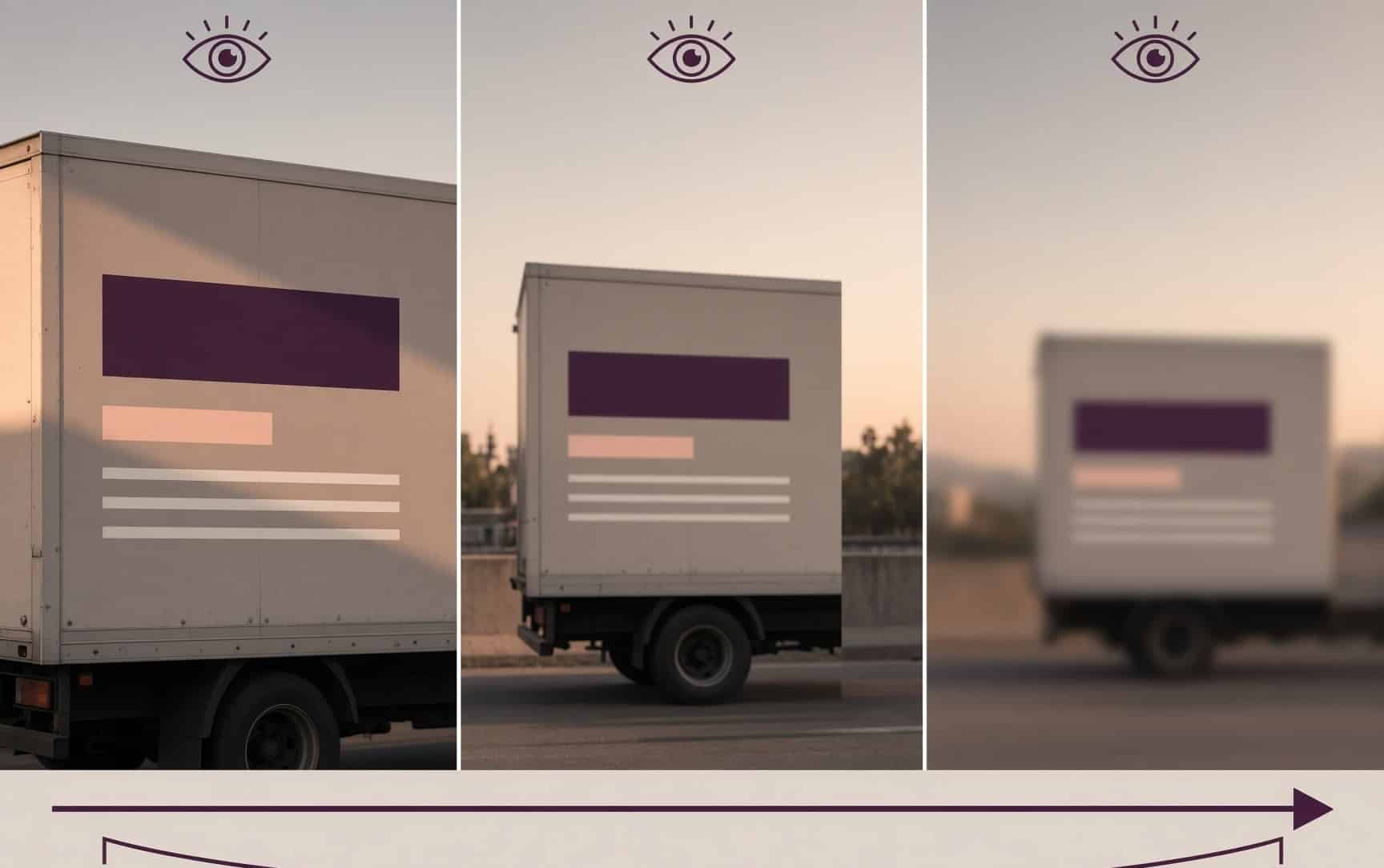
Size the text for the viewing distance, pair colors with a large brightness difference, and use a simple, bold font. Those three choices decide most of what a passing viewer can read.
Size the text for the distance: A common sign-industry rule of thumb is one inch of letter height for every 10 feet of viewing distance. Treat it as a guide, because light and speed shift it.
| Viewing distance | Letter height by the rule of thumb |
|---|---|
| 30 feet | 3 inches |
| 50 feet | 5 inches |
| 100 feet | 10 inches |
| 150 feet | 15 inches |
The company name and the phone number or web address take the largest sizes the panel allows. Supporting lines can be smaller when they stay secondary.
Pick colors with strong contrast: Dark text on a light background and light text on a dark background both work. Common strong pairs include black on white, dark blue on white, white on dark green, black on yellow and white, or yellow on navy. A solid color block behind the text can set it apart from the vehicle's own color.
Limit the palette: Two or three colors cover most brands. Matching the colors on your website and other marketing makes the vehicle look like the rest of the business.
Choose a simple bold font: Thin, script, and highly decorative fonts blur at a distance. When the logo uses a stylized font, show the company name again in a plain font elsewhere on the vehicle.
Watch the glare: A glossy laminate adds shine, and strong sun can turn that shine into glare across the text. A lower-sheen laminate is one option to ask about when readability matters most.
Text that disappears in grayscale has too little contrast, even if it looks fine in color on screen.
How Do You Design a Vehicle Wrap Around the Vehicle's Shape?
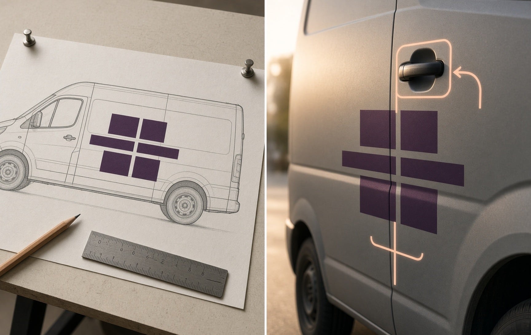
Design a vehicle wrap on an accurate template of the actual vehicle. Keep text and logos on flat, unbroken areas away from handles, seams, hardware, and lower edges. A flat mockup hides all of these.
The short version of designing a vehicle wrap is to start with the vehicle, then add the logo. A flat side view also misleads about angles. Tall vehicles are seen from below, and viewers stand at the curb, in the next lane, or behind you. Check the layout from those spots as well as head-on.
Doors and handles: Door handles, fuel doors, and mirrors break up a panel. The logo and company name belong on the open areas between them, because a word split by a handle is hard to read and looks like a mistake.
Seams and panel gaps: A large wrap is printed in panels, and a seam can fall wherever the template shows one. Letters and logos stay off the seam lines. Side graphics often run partway around corners so the installer can join panels out of sight.
Windows: Rear glass can carry branding through perforated film, and film limits vary. The FAQ below covers window graphics.
The rear: The rear gets the longest look from following traffic. On cargo vans with barn doors, the gap between the doors and the space between the two rear windows are the hard parts, so test the layout on the real door shapes.
Lower edges and high-wear zones: Work vehicles take scuffs at door edges, handles, steps, and lower panels. The phone number and other key lines sit above those zones, while the lower panels carry background, pattern, or secondary details.
How Is Truck Wrap Design Different From Van Wrap Design?
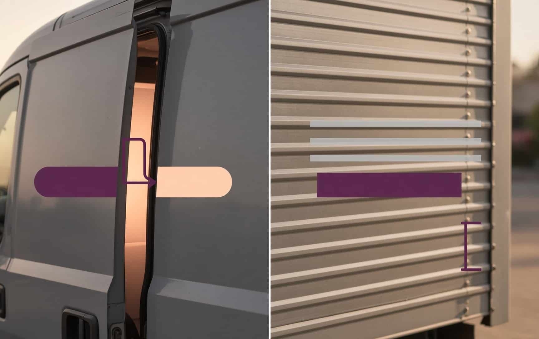
Van wraps work around sliding doors, barn doors, and compound curves. Truck wraps work around large flat sides, roll-up doors, rivets, and the break between cab and box. Truck wrap design and van wrap design share the same hierarchy and contrast rules and differ in layout.
| Vehicle | What drives the design | Design rule |
|---|---|---|
| Cargo van | Sliding door, barn doors, curved panels | Keep key content off the part hidden when the sliding door opens, and check for partial words as it moves. |
| Pickup | Cab doors, bed sides and tailgate | Give each zone its own clear job, and keep text from crossing the gap between cab and bed. |
| Box truck | Roll-up door slats, corrugation, rivets | Measure the roll-up door fully closed, keep fine text off ridges and rivet rows, and treat the cab and box as two coordinated zones. |
| Trailer | Large flat sides, rear swing doors, landing gear | Use the big sides for the main brand message, keep text away from the center gap and hinges on the rear doors, and run background color through areas the hardware blocks. |
| Car | Curved panels, few flat areas | Place the name and one contact line on the flattest areas of the doors and trunk. |
| Bus | Windows, doors, and operational markings | Stage the key content in central, uninterrupted areas away from doors and windows. |
Trade vehicles follow the same rules with their own angle. Our HVAC van wrap design post covers heating and cooling vans, and our plumbing van wrap post covers plumbers. Our box truck wraps post explains why box trucks earn their place in a fleet, and our bus wrap design post covers buses.
See our commercial truck wraps and commercial van wraps pages for each vehicle type.
How Do You Keep One Fleet Wrap Design Consistent Across Vehicles?
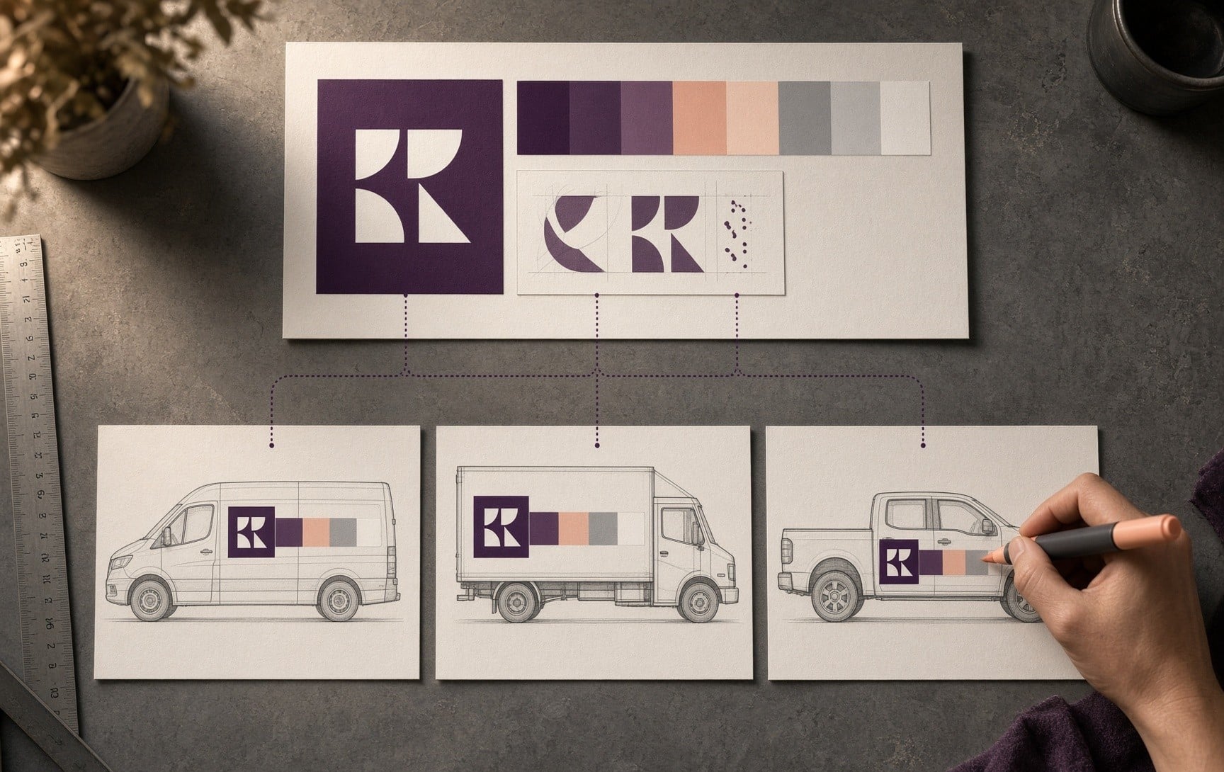
Build one master design system, then adapt it to each vehicle type, so logo placement, colors, and messaging stay the same while sizes change. That is the core of fleet wrap design.
The system fixes the rules: where the logo sits on each vehicle type, the exact color values, the fonts, and the phone and web address rule. Each vehicle then gets its own sizing under those rules. Copying one layout from a van onto a box truck rarely works, because the panels, doors, and hardware differ.
A matching fleet reads as one business. When the vehicles stop matching, business vehicle wrap branding reads as several businesses, and corporate vehicle wraps lose their effect.
Two questions help before approving a fleet. Who holds the approved master files for future vehicles? Can you see a printed sample of your most important brand color?
At Queen of Wraps, one master design applies across a fleet, and every location follows the same design and production process. Our commercial fleet wraps page explains how fleets move through that process. When an older fleet has stopped matching, our fleet branding refresh post lists the signs.
What Are the Most Common Vehicle Wrap Design Mistakes?
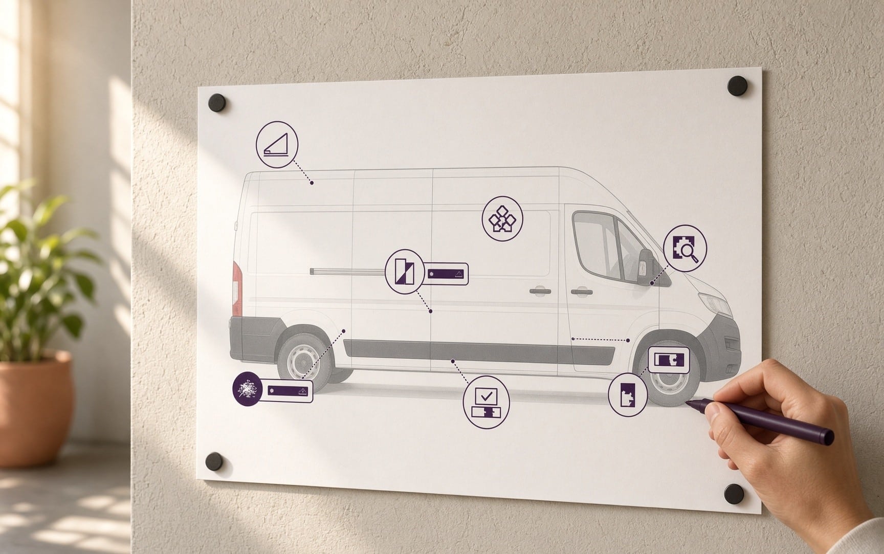
Seven mistakes cause most vehicle wrap design failures, and each one is avoidable at the design stage.
- Designing on a flat model. A flat side view ignores how tall vehicles are seen from below and from several angles.
- Putting key lines in high-wear zones. A phone number near a door edge, step, or lower panel gets scuffed first.
- Letting hardware split the text. A seam, rivet row, handle, or sliding door can cut a word in half.
- Overloading the panel, or leaving it empty. Too much competes for attention, and too little looks unfinished.
- Using a low-resolution logo. A logo copied from a website is usually too small to enlarge to vehicle scale.
- Adding legal markings last. USDOT and license numbers pasted on after the layout is done look patchy and can crowd the design.
- Skipping the proof check. A typo in a phone number prints on every vehicle in the fleet.
Can You Design Your Own Vehicle Wrap?
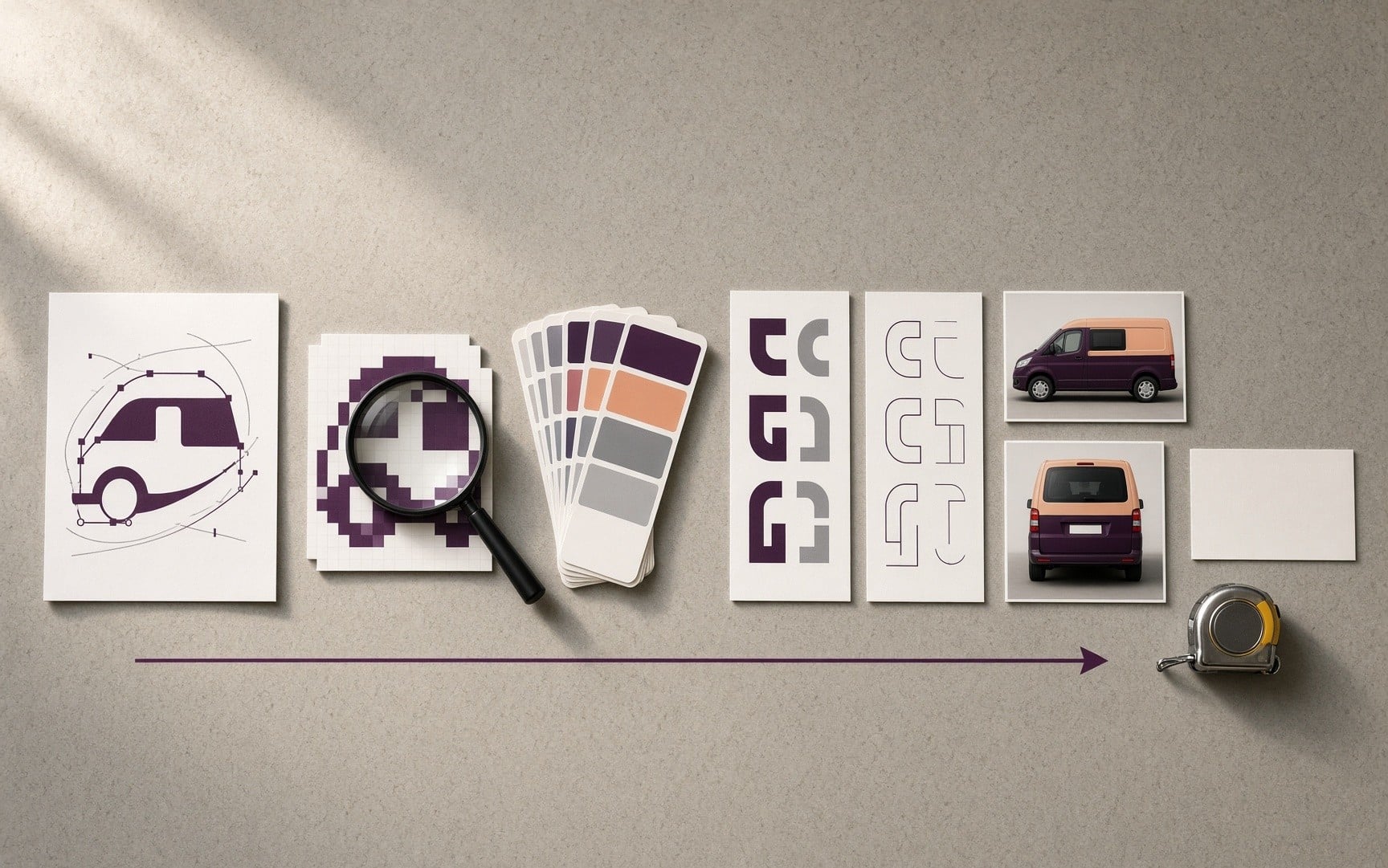
Yes, you can design your own vehicle wrap and bring us the artwork, or you can bring your brand and let our designers build it. We accept customer artwork.
Many owners start with the thought, "I will design my own vehicle wrap." That is a good starting point. What helps most is a complete set of materials:
- Your logo as a vector file (AI, EPS, or PDF) when you have one.
- Your brand colors and fonts.
- The exact make, model, and year of each vehicle.
- Straight-on photos of each side, the rear, and the front, when you have them.
- Any legal numbers that must appear.
Online tools that let you design your own vehicle wrap online show a preview. A print shop prints from a vector file laid on the vehicle's template, and a preview alone does not provide that. Our designers work from your artwork on a vehicle template, and you approve a mockup before anything prints.
Trade sources report that artwork from agencies and marketing teams often arrives out of scale for the vehicle, with handles and hinges left off the layout. Several checks come before printing, regardless of who supplies the artwork. They cover the fit to the vehicle template, file quality, color, the accuracy of every word and number, and the position of seams and hardware. Printers set their own specs for file type, bleed, and resolution, so ask for the template and specifications before you finish the art.
Our vehicle wrap design services cover both routes, from finished artwork to a design built from scratch.
What Should You Look for in a Vehicle Wrap Design Proof?
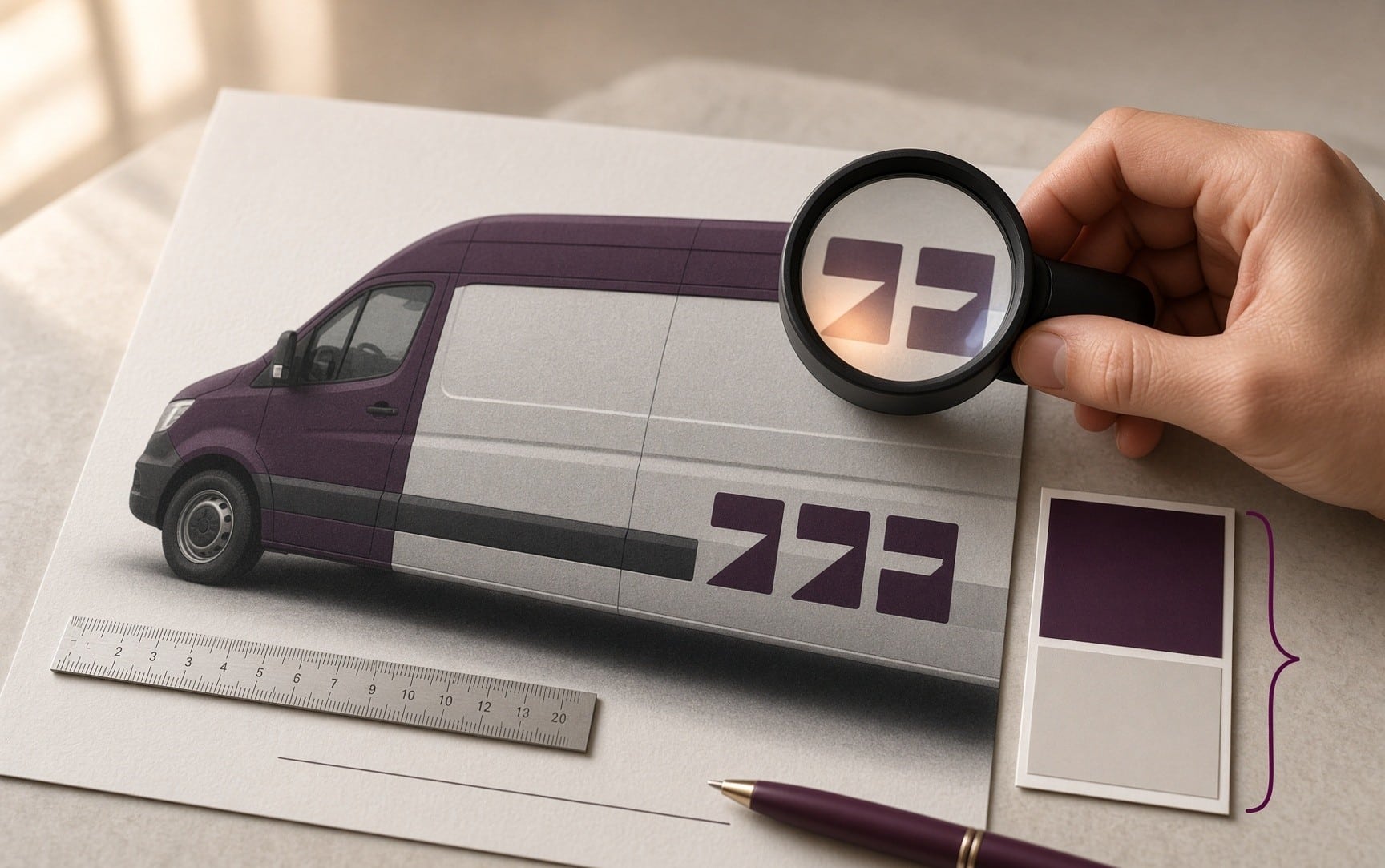
Check the words first, then the fit, then the contrast. Errors found after printing cost a reprint, so the proof is the last cheap place to fix them.
- Read every word and every digit of the phone number and web address, one character at a time.
- Confirm that no key text or logo sits on a handle, seam, hinge, or sliding door gap.
- Match the scale and placement to the real vehicle, beyond the flat template.
- Shrink the proof or step back and check that the main message reads quickly.
- Zoom in on the logo and fine lines to confirm they are sharp.
- Hold the brand colors against your standards, and ask for a printed sample of the most important one.
- Look at each side on its own to confirm it makes sense by itself.
- Make sure any legal markings are present and readable.
- Agree on how lines run: along the body lines or level to the ground.
- Ask what your approval covers before you sign it.
How Does Our Vehicle Wrap Design Process Work?
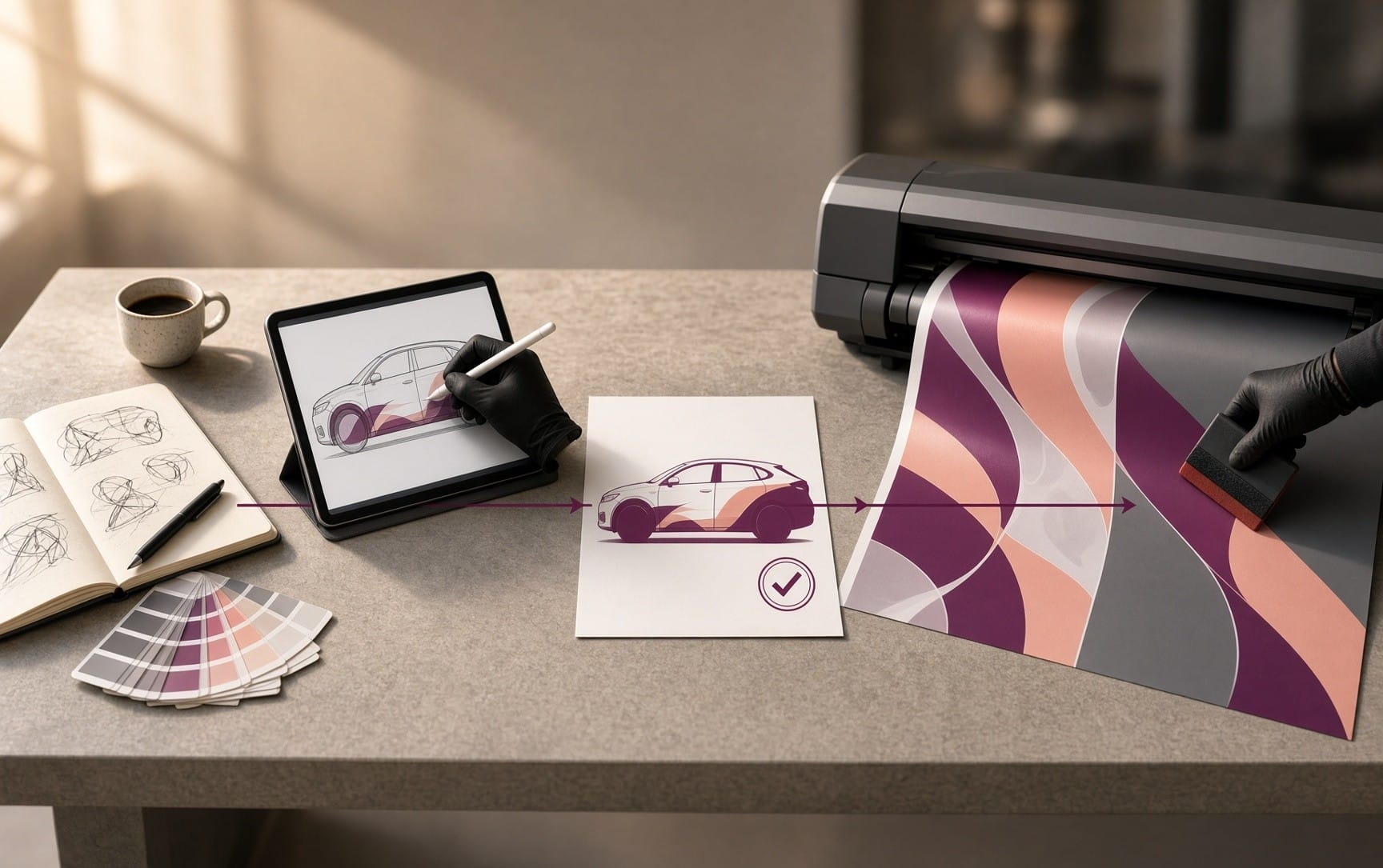
Our in-house design team starts with a consultation, builds your design on a vehicle template, and gets your approval on a mockup before anything prints. We print in-house, and one team manages every project from design to install.
- Consultation: we learn about your brand, your goals, and the vehicles involved.
- Design: our designers build the layout on a template of your vehicle for an accurate preview.
- Mockup: you review and approve it before any printing starts.
- Print: we print every wrap in-house. Our print and production page covers that stage.
- Install: we apply the finished wrap to your vehicle. Our installation page explains that stage.
Start with our vehicle wrap design services page, or browse our portfolio to see finished work.
Frequently Asked Questions
What colors work best on a business vehicle wrap?
Two or three colors from your brand palette work best, with strong contrast between text and background. Black on white, dark blue on white, white on dark green, and black on yellow are common strong pairs. A grayscale check shows contrast problems that color can hide.
What font is best for a vehicle wrap?
A simple, bold font reads best from a distance. Thin, script, and highly decorative fonts blur. When the logo uses a stylized font, show the company name again in a plain font elsewhere on the vehicle.
Can you use photos or illustrations on a business vehicle wrap?
Yes, as long as the images are high resolution and support the message. A photo or illustration should never cover the logo or the phone number. A landscaping company could show a clean lawn behind its name, because the lawn supports the brand without competing with it.
Should you put a QR code on a vehicle wrap?
Only as an extra. Nobody scans a code from a moving vehicle, so a QR code serves people who are stopped, such as drivers behind you at a light or neighbors near a parked vehicle. A common rule of thumb puts the scanning distance at about 10 times the code's width, so a code meant to be scanned from 10 feet away needs to be about a foot across. A QR code never replaces a readable phone number or web address.
Do you need a USDOT or license number on your vehicle wrap?
It depends on the vehicle and the business. Federal rules call for the carrier name and USDOT number on both sides of an interstate commercial motor vehicle, in a contrasting color and legible from 50 feet while stationary. Nevada requires licensed contractors to show the company name and license number on commercial vehicles, in letters about 1½ inches high. Rules differ by state and vehicle type, so confirm the requirements with the agency before finalizing the design, and leave space for them from the start.
Can you put graphics on the windows of a wrapped vehicle?
Often on the rear glass, using perforated window film. The film shows a graphic from outside while people inside can see out. Front windshields and front side windows are generally not allowed, and state rules vary, so confirm what applies to your vehicle before designing for windows. Trade guidance also notes that perforated film suits the rear windows of trucks except when the truck pulls a trailer.
The Bottom Line
A business vehicle wrap has a few seconds to work. Give it one clear message and text sized for the distance. Add contrast that survives grayscale, a layout built for the real vehicle, one system across the fleet, and a careful proof check.



